



Selecting Paints for Painting and Rules for Mixing Colors
 Art DomSeptember 30, 2026
What do the symbols on paint tubes mean? How do you choose the right paint for creating a high-quality painting? How should you select and mix paints to achieve a specific shade in your artwork? In this article, we have collected practical and useful everyday tips for artists. The secret to clean, rich painting begins not on the canvas, but with the selection of paints. Even an experienced artist risks getting dull colors instead of sophisticated, refined shades if the physics and chemistry of pigments are ignored. Modern professional paints have clear labeling, with opacity, lightfastness, and Color Index being among the key parameters to consider.
Below you will find 20 practical tips and ready-to-use color-mixing formulas for everyday painting. This comprehensive guide has been specially adapted for working with professional ROSA Gallery oil paints and Royal Talens ranges, including the professional Rembrandt line and the semi-professional Van Gogh line. Bookmark this page so you will always know which square to look for on the label and how to mix the perfect emerald shade.
Part I: Anatomy of the Ideal Paint (Tips 1–10)
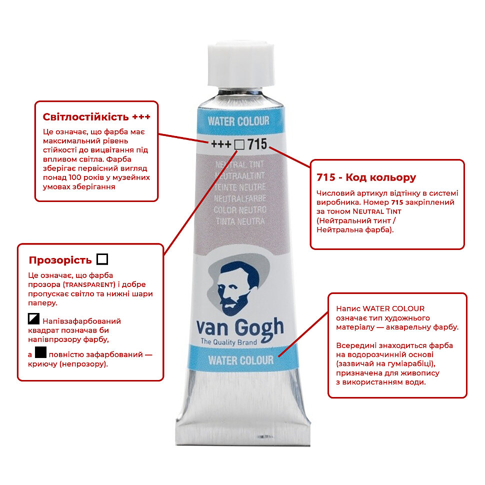
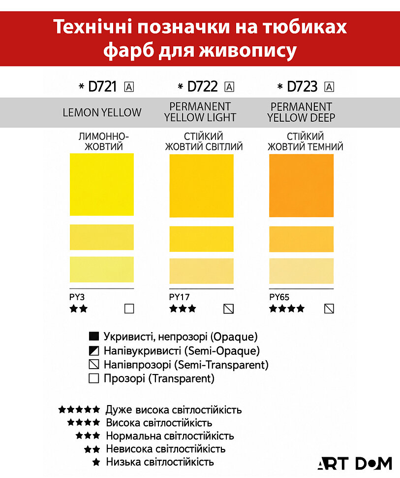
1. Read the lightfastness “stars”. Always check the number of stars (or plus signs) on the tube, as this indicates how resistant the color is to fading.
- Three stars (***): The highest lightfastness rating; the color can remain stable for up to 100 years — an ideal choice for serious painting.
- Two stars (**): Medium lightfastness (approximately 25 years), suitable for beginners, studies, and sketches.
- One star (*): Low lightfastness; the color may begin fading in sunlight within a year — avoid such paints for professional work.
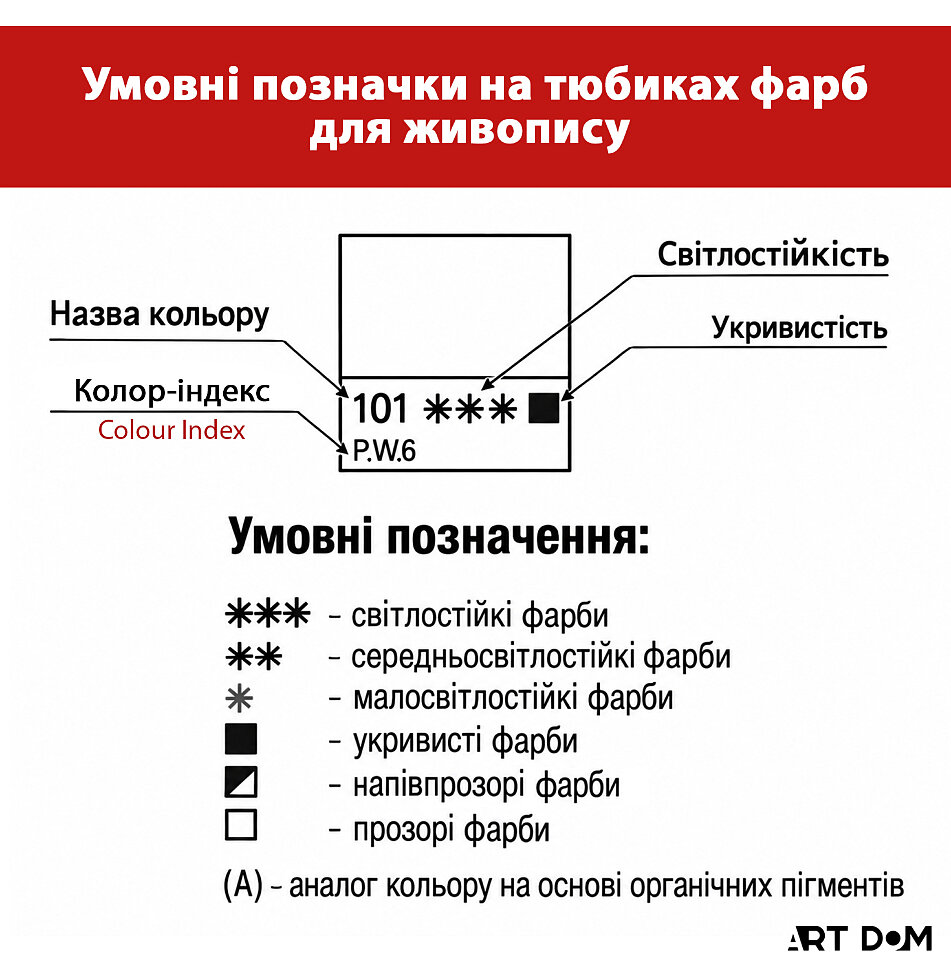
2. Control transparency using the square symbols. Opacity (the ability of paint to cover underlying layers) is indicated by squares.
- White square (transparent): Ideal for glazing and thin transparent layers. With a suitable thinner, they can be diluted to achieve an almost watercolor-like effect.
- Black square (opaque/body colors): These paints provide dense coverage on canvas and cannot be diluted to complete transparency. Use them to create texture, impasto effects, and body in your painting.
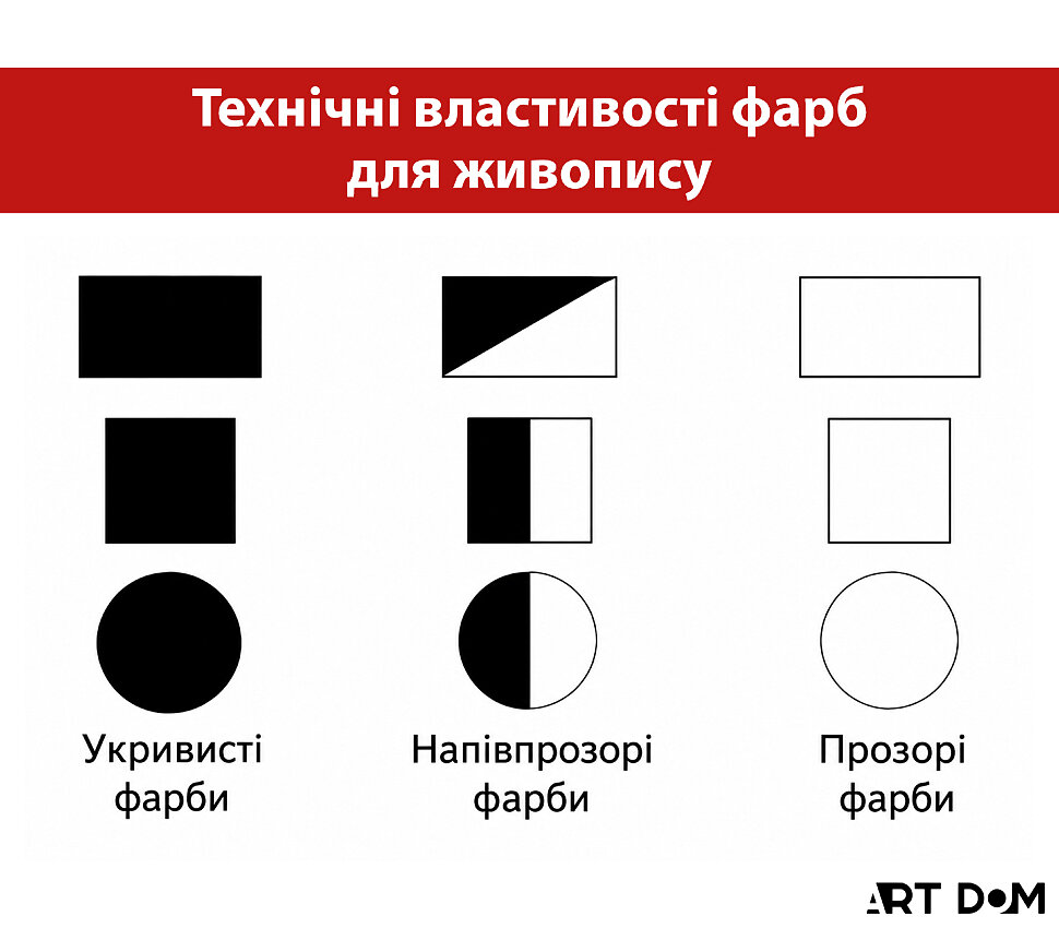
3. Use semi-transparent paints for clean mixtures. A half-filled square indicates a semi-transparent paint. These colors mix effectively with both opaque and transparent paints, allowing you to achieve clean, nuanced shades.
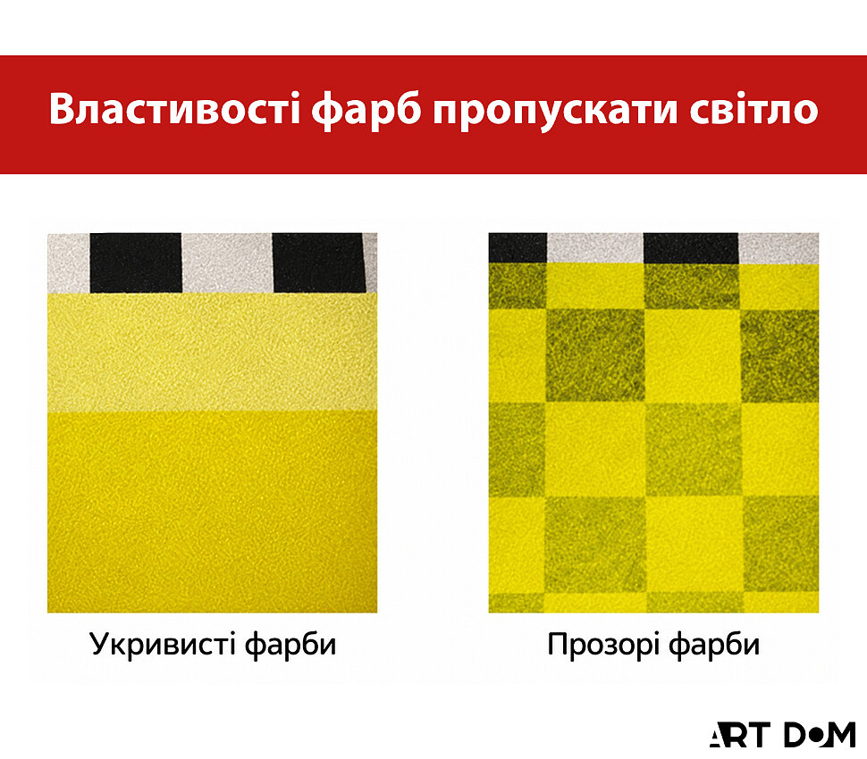
4. A strategy for whites. Always keep two types of white paint in your palette. Zinc White is transparent and suitable for delicate highlights and glazing, while Titanium White is highly opaque and ideal for dense, bright highlights.
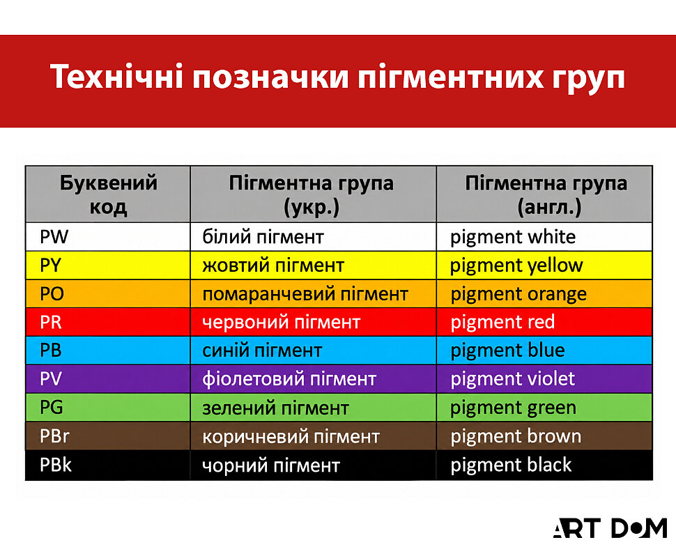
5. Use the Color Index. Paint tubes usually display an alphanumeric code (for example, PB15 or PY35). The letters identify the pigment color group, while the numbers identify a specific pigment within the international Color Index system. Understanding these codes helps you predict mixing results more accurately. For example, combining Strontium Yellow and Lemon Yellow oil paints may produce an undesirable muddy greenish shade.
6. Choose the right paint range for your purpose. For serious finished paintings, use professional ranges with high-quality binders such as linseed or poppy oil and a high pigment concentration without excessive fillers. ROSA Gallery oil paints and Royal Talens Rembrandt are excellent options. For sketches or training, semi-professional alternatives can be used, where expensive pigments may be replaced by imitation pigments, such as in the Van Gogh range. Student-grade paints containing large amounts of synthetic components and fillers are best avoided in finished professional works.
7. Assess quality visually. Poor-quality paint often reveals itself immediately. Avoid materials if you notice separation, such as oil coming out of the tube before the pigment, excessive fluidity, or, conversely, an excessively stiff consistency. Foreign particles and poor spreading characteristics, when the paint forms uneven streaks, can also indicate inferior quality.
8. The single-brand rule. Whenever possible, mix paints from the same manufacturer, even if they belong to different product ranges (for example, only ROSA or only Talens). This helps maintain compatibility between binders and provides more predictable color behavior.
9. Consider flexibility. A high-quality binder based on natural oils, wax solutions, or dammar resins contributes to the flexibility of the paint layer. Paints with poor flexibility may be more prone to cracking after drying on canvas.
10. Consider how the painting will age. Professional artists think not only about how a mixture looks today, but also about how it may behave over the years. Using professional-quality paint ranges reduces the risk of colors becoming dull, losing their gloss, or noticeably changing in tone.
Explore our art supplies and choose the right materials at the best prices
Browse PaintsPart II: The Alchemy of Color (Tips 11–20)
Practical formulas for creating complex shades with ROSA Gallery and Royal Talens oil paints.
11. “Sophisticated Blue Combination” (Deep Night Landscape)
To paint a deep, velvety night sky with silhouettes of cypress trees, mix Cobalt Turquoise with Phthalo Blue. This combination produces a sophisticated, complex dark color that does not appear flat.
12. “Glow Effect” (Neon and Artificial Light)
To depict swimming-pool water glowing at night or neon reflections, combine bright Turquoise Blue with dark Phthalo Blue. This mixture helps create the illusion of light coming from within the object.
13. “Warm Glow Effect” (Moonlight in the Clouds)
To create an atmospheric night sky with moonlight breaking through the clouds, mix Yellow Ochre with Phthalo Blue. The ochre softens the intensity of the phthalocyanine blue, producing a complex greenish-silver glow.
14. “Deep Emerald” (Sea Depth)
You do not need a ready-made green paint to achieve a rich color for seawater beneath a boat. Mix Phthalo Blue with Cadmium Yellow Medium. The resulting color will appear much more vibrant than a pure emerald straight from the tube.
15. “Warm Green” (Sunlit Foliage)
For lush green foliage illuminated by sunlight, an effective combination is Cadmium Yellow Medium with Phthalo Green.
16. “Cola-Colored Mountains” (Mountain Sunset)
To reproduce the warm reddish-brown color of mountain slopes illuminated by the setting sun, combine Vermilion / Cadmium Red with dark Mars Brown. The resulting shade is dense and deep, resembling the color of Coca-Cola.
17. Basic “Skin Tone” (Portrait Base)
A classic mixture for light skin tones in portrait painting is Yellow Ochre + Madder Lake Deep / Alizarin + Cadmium Red Light. This trio allows you to finely control warmth and natural blush tones.
18. “Light Shadow” (Anatomy in Shadow)
An unusual combination can help create a shadow on the human neck without making it appear muddy: Mars Brown and Phthalo Green. The two colors neutralize each other, producing a natural, transparent shadow with a balanced warm-cool character.
19. “Sunny Landscape” (Air and Light)
For a bright, sunlit meadow or luminous landscape, use a complex mixture of Cadmium Yellow Light + Cadmium Red Light + Cerulean Blue. Cerulean adds a necessary sense of air and prevents the warm mixture from becoming visually too heavy.
20. Controlling Transparency in Color Mixtures
When creating shades, always consider the opacity of the original paints. By mixing fully transparent Phthalo Blue with opaque Cadmium, you will obtain a semi-opaque mixture. Understanding this system of opacity symbols (the squares on the tube) allows you to anticipate how a brushstroke will behave on the canvas before the brush even touches the surface.
Explore our art supplies and choose the right materials at the best prices
Shop Art Supplies